 Brand manual · 2026
Brand manual · Version 1.1 · November 2026
One place in Shiselweni, four things it sells: hospitality, adventure, wellness and learning. This manual keeps the logo, the colours, the words and the photography pointing the same way, whoever is making the poster.
01 · The mark
Two official files now: the primary lockup for light backgrounds, and the approved reversed lockup for dark ones, drawn from the AI artboards supplied on 12 November. Everything else is a downsized copy of those files.


| Clear space around the logo | half the height of the mountain mark |
| Minimum width, full logo, print | 35 mm |
| Minimum width, full logo, screen | 140 px |
| Header height on this site | 44 px logo, 36 px on mobile |
| Mountain mark alone | 96 px on screen, never below 24 px |
The reversed lockup is now approved for deep canopy (#0E2818) and black: white mountain outlines, white subline, red wordmark still. On medium Tfutjana green (#1A4D2E) it still does not work, because red on that green vibrates and fails contrast. There, use the cream panel or the mountain mark alone.
02 · Colour
Two sets, and they do different jobs. The logo colours are fixed inside the mark. The site palette carries the whole page.
60% cream and white, 30% green, 10% brown or red. Red stays the smallest share, so an alert still reads as an alert.
White on Tfutjana green and white on Deep canopy both pass at body size. Red on green does not, and neither does cream text on brown at small sizes. If a colour pair looks muddy, it is: use the ink colours for text.
03 · Typography
No typeface was supplied with the logo, so the web system was set in two open-licence Google Fonts. Both are free for commercial use, which means nobody has to buy a licence to make a poster.
Sans, weights 300–700. Headlines, prices, buttons, body copy. Used for everything by default.
| Display / page title | Outfit 700 · 40–64 px |
| Section heading | Outfit 700 · 26–38 px |
| Card heading | Outfit 600 · 18–20 px |
| Body | Outfit 400 · 15.5–17 px |
| Label, eyebrow | Outfit 600 · 12 px, 0.16em tracking, caps |
Libre Baskerville italic. One line of accent per page at most: a quote, a place name, a slogan under a photo. Not for body copy or buttons.
04 · Image
Real visitors on real ground. Every image on this page is from the resort, not stock, and that is the rule. The four things people come for are the ones to show.
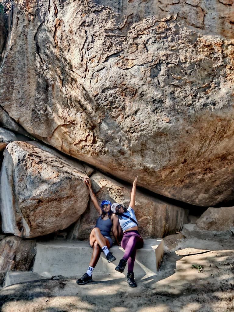 Landscape first
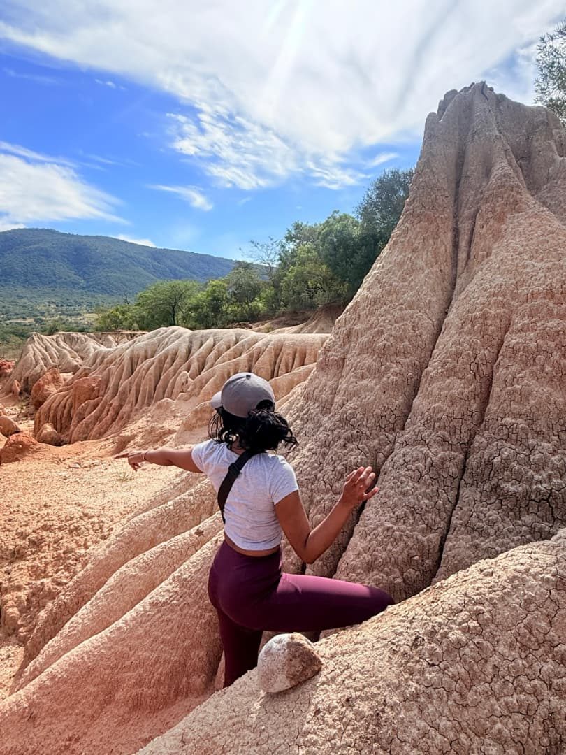 The grounds
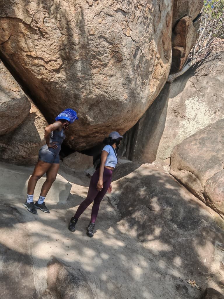 Rooms
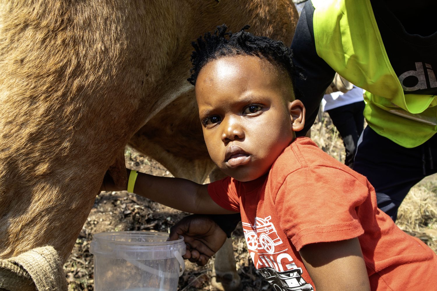 Families
05 · Voice
A place, not a brand campaign. Say where it is, what it costs, and what the visitor will actually be doing.
| "Day visit, E70 for adults, E50 for kids" | price + unit |
| "Booking and payment prior is essential" | terms, stated up front |
| "Chillas Corner", "Donga", "kaKholwane" | the real names |
| "Hospitality · Adventure · Wellness · Learning" | the four pillars, in that order |
"An exclusively private, quiet place with breath-taking views in Shiselweni: stay, eat, hike, climb, heal."
06 · The fixed details
These are the lines that must be identical on every poster, menu, invoice and social bio. Copy them from here.
| Full trading name | Tfutjana Mount Resort and Sinos Restaurant |
| Short form | Tfutjana Mount Resort |
| Restaurant | Sinos Bouquet Garni Restaurant |
| Location | Mkhondvo, kaKholwane, Shiselweni Region, Eswatini |
| Region code (SEO) | SZ-SH |
| Currency | Emalangeni, written E or SZL |
| Bookings | 7837 4027 |
| Second line | 7815 4650 |
| 7837 4027 | |
| International form | +268 7837 4027 |
| Website | mediaplugsz.com/tfutjana |
| Gallery | mediaplugsz.com/gallery |
07 · Files
Take the vector, not a screenshot. The PDF is the whole manual for a printer or a new designer.